
Friday, December 28, 2012
Saturday, December 22, 2012
Ruman & Rupert Birthday Cards
I created these for fun because they seem to fit into the brand of Ruman & Rupert. So far they have been a big hit. When I have more time between all the administrative work to keep up with there will be definite additions. To see more visit the Ruman&Rupert store http://www.zazzle.com/vectree.


Sunday, October 14, 2012
New Ruman & Rupert Art
Line of themed art that will be available for product licensing. To see more visit the Ruman&Rupert store http://www.zazzle.com/vectree.


Nano Bots
These little guys are the beginning stages of an ad campaign for an industrial lubricant company in England. We are currently working with a British ad agency to develop the art and look.


Prototype Character for App (more to come)
Honestly I don't even know what the app is for. The client was very specific in the description. I guess when we move to the next stage of having him in different positions I will inquire further.


Sunday, August 12, 2012

Friday, June 8, 2012
Florida Inspired Travel Posters
 |
| Ft. Lauderdale Florida Travel Poster |
 |
| Bill Baggs State Park Travel Poster — Near Miami Florida |
 |
| Vintage Miami Florida Travel Poster |
Thursday, April 26, 2012
One of my favorite Illustrator techniques
Like most illustrators, we all may have several different styles and techniques that can be used at any given time. Today I will share one of my favorites and perhaps give a little insight into on how to get from point A to Point B on an illustration project.

1. In most cases there will be a round of pencil sketches. This is a back and forth process with the client to get the basics of layout just right.
2. Scanning! This is a complex process that should only be attempted by professionals. It requires at the least a masters degree from MIT. So I won't go into detail on this one.

3. Once the pencil sketch is in the computer, it will be placed it in Adobe Illustrator, on a layer called "template". This is the road map for the creation of the art. The disclaimer here is that the sketch may or may not be followed exactly. There can be changes along the way to improve the art in the computer.


4. Create another layer called "silo". The view will be changed to outline mode so all that can be seen is the line work and pencil sketch. Objects will be traced around and filled with Black (or any other solid color). Thus creating a silhouette.


5. Create a layer called "color". Still in outline view mode, trace and draw the areas that will be colored in. For now, keep the fill color as white.


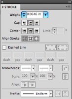
6. Once everything is traced neatly, change the view mode back to "preview". It should look like something out of a coloring book. Just Black and white. Going back to the "silo" layer, add a stoke to the outline. From here the line width can be adjusted from thin to thick to give the image more impact if needed.


7. Set up the color palette depending on the feel of the art. I must admit I lean more towards vibrant colors. From those colors will be created two additional colors. Adjusting the color levels, make a lighter version and a darker version of each color.

8. Coloring Time! Select each piece on the "color" layer and fill it with the appropriate color. Depending on preference, it is possible give a slight gradient to those pieces for an over all slight lighting effect. If this is done, make the gradient very subtle and not overpowering.

9. Lighting, my favorite step. A layer called "light" will now be made. Take in account where the light sources are and give the art a feeling of depth. This step does not depend on the template layer. So that will be turned off as it will be a destruction at this point. This step is also where to put a little bit more personal flare and style into the art. Draw the lighted areas in sections. When I first started using this technique, I would use a function in illustrator called "draw inside". This would butt the lighted area up against edges. I have long abandoned that however because I find keeping the "light" layer separate gives much more control. So when I draw the light areas, I draw it close to edges without touching. I like doing it this way also because I feel it gives an additional level of depth.


10. Optional shadow level. Depending of how much depth that needs to be portrayed, an additional layer called "shadow" can be added. Its pretty much the same technique as lighting but of course using darker colors to push up the shadows. Most of the time the contrast between the "color" layer and the "light" layer will give more than enough effect to complete the visual.

Well there you go. If anybody has any slight modifications to this particular way of using illustrator, I would like to see your comments.
Thanks for the look. And please visit www.vectree.com to see more samples of my work.
Saturday, March 31, 2012
Travel Poster
I've always been a fan of vintage travel posters. One of my favorite artist today, Kerne Erickson is a genius at these. So with a little inspiration, I took a crack at creating my own. Maybe with some positive feedback I'll do a series.
 |
| Visitors are welcomed at Pan American Base Miami |
Welcome
Welcome to the blog of Vectree. We are primarily a vector based illustration studio. However due to our extensive background in graphics and print, we can also offer just about any custom visual our clients may require.
Through this blog we are hoping to share some of our more recent works or anything that may be on our minds. Please feel free to contact us anytime with your ideas. Please visit www.vectree.com to see more samples of my work.
Subscribe to:
Posts (Atom)